In one of my recent posts I talked about how I have introduced Storybook to the team and how we adopted it in our development lifecycle.
In this article, I want to share with you, my experience building an accessible custom input React component and how I found Storybook a useful dev tool that helped me achieve my goal.
Let’s start!
Challenge 🤓
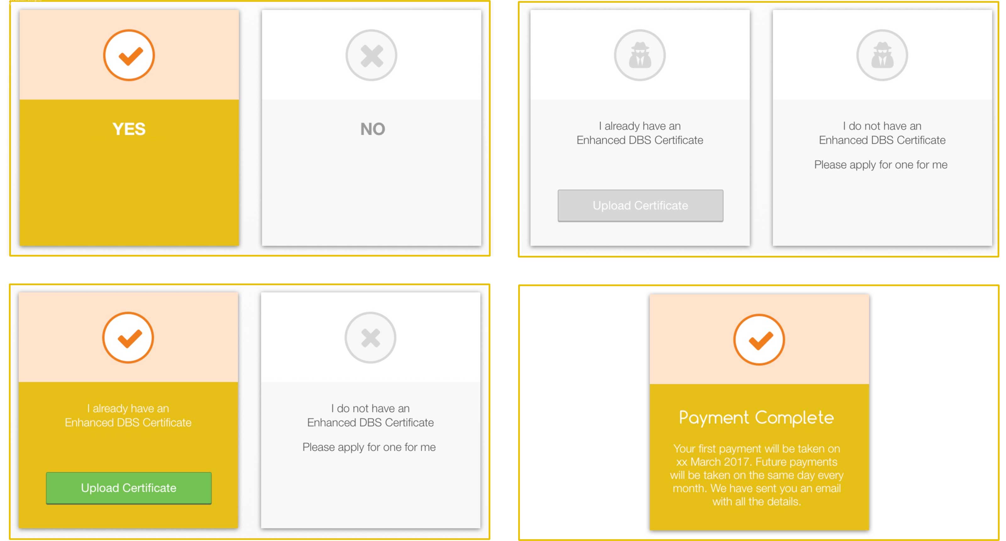
In this project, several views are sharing a similar piece of UI, a box with an icon and some text. In some cases, it also contains a button and an additional paragraph of text. I want the box to be a separate React Component so I can re-use it across the application. I need to identify all common features and pass them as props to the component so it will be able to behave differently in each instance. Given that this component will be a custom input, I want to make sure that the element is visible and usable from screen readers, it won’t take too long, and it will make a big difference for many users.

Scaffolding 👷
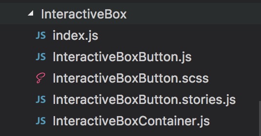
First, we need a name for our new component. Then a folder and file structure.

This style comes from a boilerplate I have been using, it’s called react-redux-starter-kit. The project has now been abandoned but I still suggest you to check it out as it was really well done 💪
I won’t include the code of the actual box as that is not the purpose of this article. Below you can see how I exported the component and how I have used it.
Export
// src/components/InteractiveBox/index.js
import InteractiveBoxButton from './InteractiveBoxButton'
import InteractiveBoxContainer from './InteractiveBoxContainer'

export { InteractiveBoxButton, InteractiveBoxContainer }
Import
// src/routes/MyRoute123/components/MyRoute123.js
import { InteractiveBoxButton, InteractiveBoxContainer } from 'components/InteractiveBox'
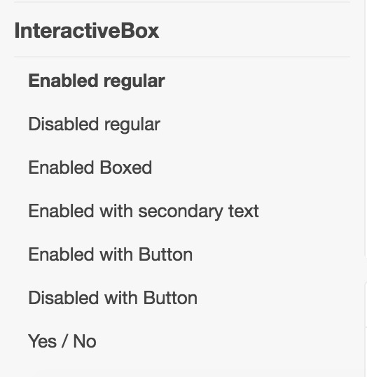
The next step is to create the stories for the component, in Storybook. A story is a scenario or particular configuration in which our component will render. The idea here is to create a story for each different case. Although this can take a bit longer than just building the component, I found this process very helpful to me in helping to discover all props and edge cases I needed to cover. It resulted in both better SASS and JavaScript code.
Moreover, you will end up with a bunch of visual tests for your component, which comes in handy in different occasions. I have talked about it in my last blog post
These are the stories that I have created so far:

State management
To handle the state of the component, so which option is selected, I decided to build a wrapper component which will act as “selector” and it will orchestrate the rendering of the child boxes. I kept the main component standalone, so I can use it even if I don’t need to click handlers or change of state in my application.
{% gist andreafalzetti/240d933f864c8674ede656e80abf844d %}
Accessibility
During the HalfStack June meetup: Accessibility and GraphQL, one of the speakers, Callum Macrae, gave a talk about accessibility and screen readers. I admit that until that moment I didn’t know much about this and didn’t pay attention to this matter when building UI. Thanks to his talk and some practice at home I learnt how to use a screen reader, in particular, VoiceOver on Mac and now I use it to test my code, especially when I build custom input elements.
Custom input fields 🤔
As @samccone said in the tweet below, don’t try to be clever with your inputs! It’s very easy to screw things up, especially regarding accessibility. Unless you learnt how to deal with it appropriately, I would recommend you to stay away from building form masks or custom input on your own.
In my case, the input didn’t involve any typing which means we just need to inform the screen reader of the presence of our component and make it clickable. Given that I am using standard text elements and regular buttons inside the component, they will be automatically discovered and read out to the user. It was enough adding role='button' and an aria-label='Description of the element' to the div container to make it visible and clickable to screen readers. It’s straightforward, but it gets missed most of the time, at least for what my experience can say.
Besides being ethically correct for me and very satisfying knowing that we are allowing everybody to use the interfaces we build, it is also an important business decision as there is a high number of users with accessibility issues.
I hope this post has been useful to you and you got my point. Next time you build a custom UI element, don’t forget to at least test it with a screen reader. If your Company or Team can afford it, I would recommend running some accessibility tests with a real user. I will leave some useful links below.
Useful links
- How–to: Create accessible data tables
- How-to: Use Placeholder Attributes
- How–to: Use Skip Navigation links
- How–to: Use TITLE attributes
- How–to: Use role=‘application’
- How-to: Hide Content
- The Value of Involving People with Disabilities in User Research (blog post)
- A Web for Everyone (book)
- Make accessibility easy, and the world will be more accessible (Accessibility in PDF)
Photo credits: @lum3n